Adobe InDesign CS6 Review
Adobe InDesign CS6 is included in all the Adobe CS6 suites except for CS6 Production Premium and is available in Singapore since the end of April 2012. Prices are as follows (excluding taxes)
- InDesign CS6 (Upgrade): S$190
- InDesign CS6 (Full): S$1,057
- CS6 Master Collection: S$3,924
- CS6 Design & Web Premium: S$2,868
- CS6 Design Standard: S$1,962
Interface
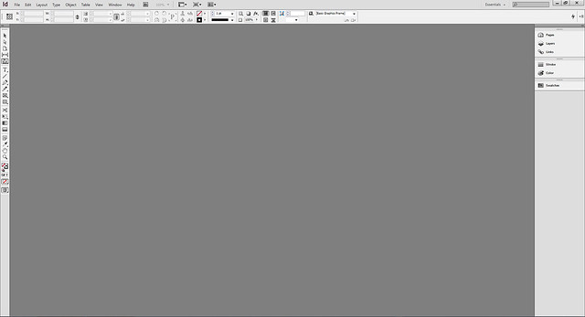
Adobe InDesign CS6 remains its grey scheme and has least changes to its interface among the design bundle.
Tooltip
The enhancement in CS6 provides a quick information tooltip showing: width and height, x-y coordinates and angle of rotation when you try to create, move and rotate an object.
Development for Print, Web & Digital Publishing
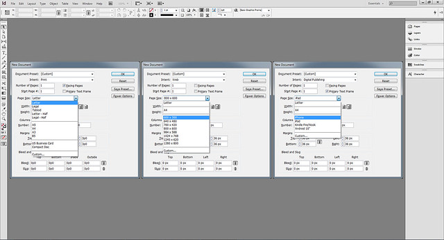
When I was first taught InDesign, I only use this for publication layout. After several versions, InDesign CS6 has repositioned itself: sharing the concept of content layout and with other design fields such as web and tablet developments. As so, users have more document size choices to begin with under its document settings. Units and measurements are taken care off after selecting the intended output.
Place and Link
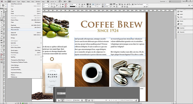
The bulk of InDesign is handling copywriting. Having the ability to update text changes automatically can be time saving. ‘Place and Link Story’ is introduced in CS5.5. This function has then been renamed to ‘Place and Link’ in CS6.
Menu: Edit > Place and Link
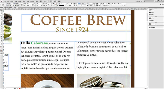
Text will be copied to the conveyor when Place and Link function is used. User can alter the text frame sizes as you paste on other pages. A link icon, indicated at the top left hand corner, differentiates the duplicates from the source text. Amendments such as addition or subtraction of text, and text formatting can be reflected.
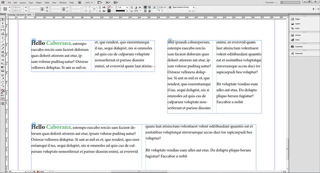
A yellow hazard icon represents that there are changes done in the source text. To update, click on the yellow icon.
Note: Please ensure that your document is in Normal screen modes. You wouldn’t be able to see the link and yellow hazard icons if your document is in these screen modes: Preview, Bleed and Slug.
Content Collector Tool
Content Collector Tool allows users to copy elements onto conveyor, reuse them on same or different pages. You might not find this tool useful if your project is small. At anytime you want to copy an element, you can simply scroll back.
But imagine handling a big project, a 100 page fashion magazine, scrolling and finding elements is very time consuming. The conveyor is serve almost like memory slots, Ctrl + C1, Ctrl +C2, Ctrl + C3, to keep elements such as banners, text style, paging, images and etc. You can find them easily in a separate dialog box, and place them whenever you need.
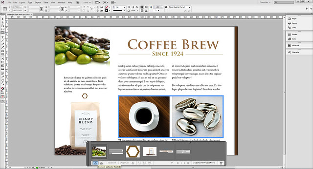
To place these elements on a page, user will have to switch to Content Placer Tool.
There are several options you can play with the Content Placer Tool: (i) Place, remove from conveyor, and load next, (ii) Place multiple and keep in conveyor and (iii) Place, keep in conveyor, and load next. Let me explain further.

Place, Remove from Conveyor, and Load Next
This placing option allow user to load the elements copied, paste them on a page and empty it from the conveyor. So this is a one off option: copy, paste and clear element.
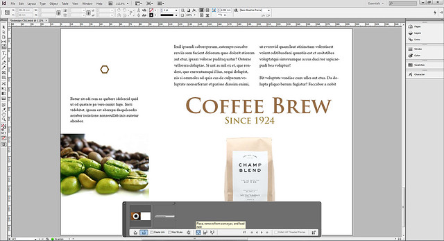
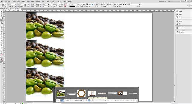
Place Multiple and Keep in Conveyor
When selected, the same element can be pasted multiple times on the page. Element will stay in the conveyor after pasting.
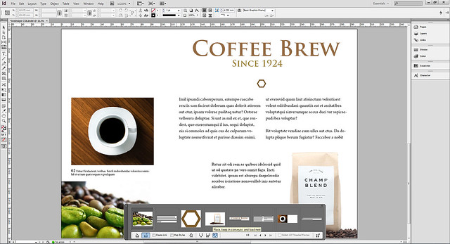
Place, Keep in Conveyor, and Load Next
This option allows element to be pasted and stay undeleted in the conveyor after pasting.
Note: Elements in the conveyor will be emptied after you closed your working document. It works like per session, and user will have to recollect the elements when you reopen the document. This part somehow doesn’t make sense. I really hope these elements can be preserved.
Liquid Layout
InDesign has not stopped from being a publication software. For the first time, Adobe tries to bridge the presentation of your content between print, web and tablet by introducing Liquid Layout.
Liquid Layout is basically a set of rules or instructions to the design elements, under circumstances where display dimension is skewed from original, how they will behave and display relatively. With this, the same content created for print, might not require re-layout for tablet display.
My demonstration might not be the best, check out the video by Adobe TV.
Menu: Layout > Liquid Layout or Window > Interactive > Liquid Layout
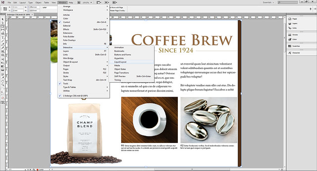
There are several attributes you can play with liquid page rule: Scale, Recenter, Guide-based and Object-based. Not all rule applies to an individual element, some apply to entire page.
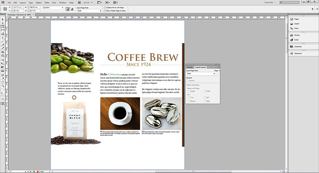
Liquid Layout – Scale
Scale rule applies to the entire page. It basically scales the entire page accordingly, as you skew the page size with a Page Tool. Page Tool allows user to preview the outcome of the page presentation after these rules are applied, but will not affect the document size set. Scale rule is one of the simplest rules you can try out.
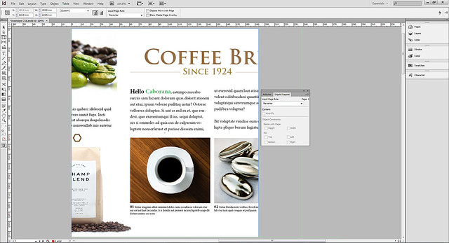
Liquid Layout – Recenter
Recenter rule also applies to the entire page. It repositions the page in the center of your new display dimension. No elements are scaled in size as the page gets bigger or smaller.
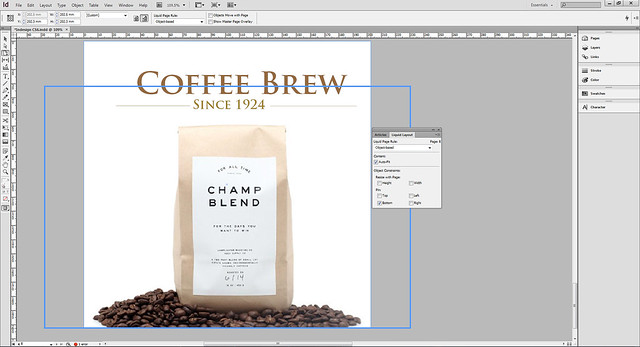
Liquid Layout – Object Based
Object-based works well if it is applied on image. Text doesn’t scale, fit and wrap nicely in the text box when page size change. Even when the text is outlined, you can get weird elongated or fat short fonts when the page distorts. This rule can be assigned to individual element.
There are a few controls you can set with this rule. You can set the object to resize as the page changes in height and width. You can also make sure the object doesn’t shift position by pinning it to top, bottom, left or right of the page.
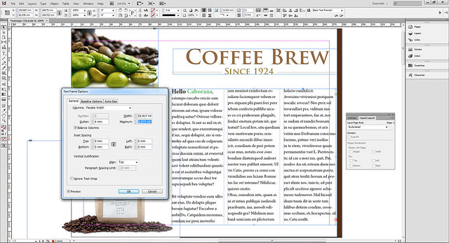
Before I go into Guide-based rule, it’s probably ideal to know about Flexible Width in Text Frame Options.
Under Columns, select Flexible Width. You define the width of primary columns, before any resizing occurs. Then you define the maximum combined column size. CS6 will automatically add or subtract columns to fit this maximum parameter when resizing occurs.
Menu: Object > Text Frame Options
Liquid Layout – Guide Based
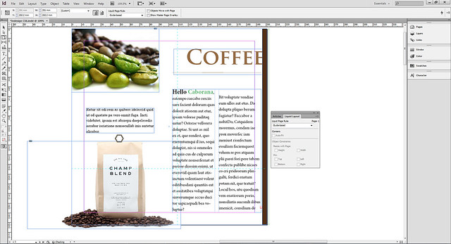
Guide-based rule is applied to the entire page. It is based on where you set the guides. Pull the guides from the ruler to the artwork. To delete the guide, select it and hit delete. This is a little confusing to me, but do check out InDesign Help to find out more.
With the previous Flexible Width in place, the columns of text shall be resizable relative to the page.
Create Alternate Layout
With all rules in placed, you are ready to transform your publication into various display dimensions.
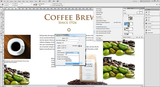
Select the down arrow under Page panel, select Create Alternate Layout. You can rename your alternate layout, change orientation and define the source reference. If you have set your page rules like what we did earlier, then under Liquid Page Rule, choose Preserve Existing to follow the rules as set. If no page rules are set, you can choose either Scale, Re-center, Guide-based and Object Based.
Menu: Layout > Create Alternate Layout or Page panel > Create Alternate Layout
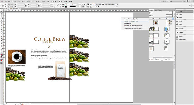
Once done, another view of the layout you’ve just set is created in the Page panel. Editing done on the new layout will not affect the source.
To delete the layout, simply click the down arrow near the layout name and select Delete Alternate Layout. Look through the new layout and tweak if needed.
Note: I wouldn’t say rules in Liquid Layout are 100% fool proof. Sometimes it just doesn’t display as you imagine. It aims to save time, but minor tweaking is inevitable.
Folio Builder
With so much preparation and talking about displaying content in relative sizes, InDesign CS6 can finally make your work take flight in digital publishing such as tablets. I will not go deeper as this isn’t my strength, but check out how this can be done from this video.
Menu: Window > Folio Builder
Conclusion
Despite having the least interface changes, Adobe InDesign CS6 has introduced quite powerful functions. I have to say I’m not well verse in InDesign in the first place, so these functions are almost hidden like fine prints; require steep learning curve to understand how they work and their attributes settings.
Liquid layout is the best thing that can happen, I thought. It saves me re-layout time, though I probably need to tweak a bit here and there to get things right. It makes reusing contents possible, and across different mediums and sizes easily.
Even being able to develop simple tablet applications with no programming, is a rocket shooting idea. Indeed a change that might affect how users use InDesign for in future.
Links
