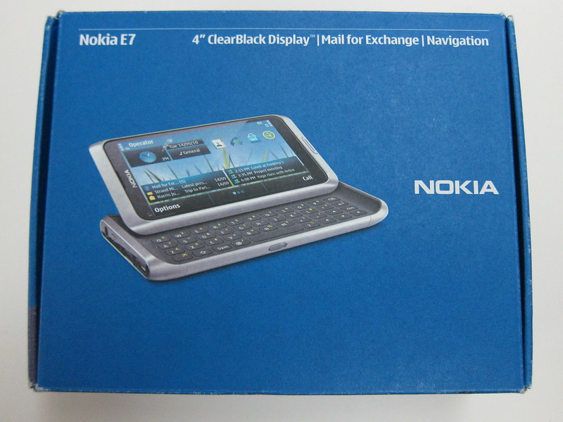
Nokia E7 Review
Nokia E7 is essentially a Nokia N8 with a keyboard. You probably heard it many times.
I will not be touching on the OS aspect as it is still based on Symbian^3 which is exactly the same as Nokia N8. This short review is mostly a comparison with Nokia N8.

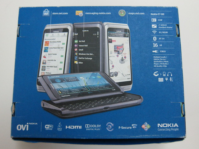
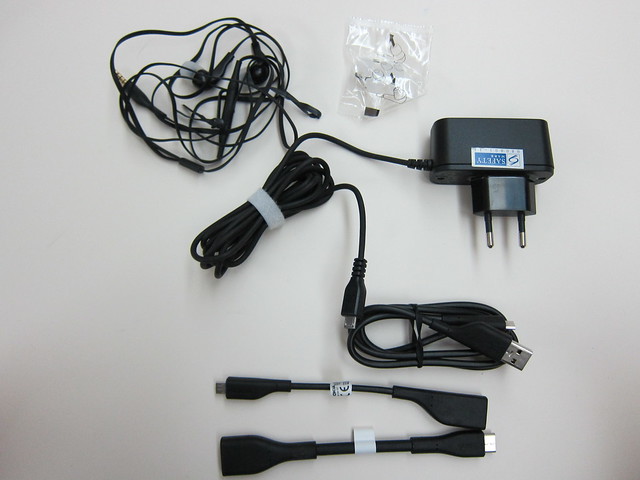
Package Contents
- Nokia E7 mobile computer
- Nokia Battery BL-4D (embedded)
- Nokia Connectivity Cable CA-179
- Nokia Stereo Headset WH-205
- Nokia High Efficiency Charger AC-10
- Quick start guide
- Nokia Micro USB On-The-Go Cable Adapter CA-157
- Nokia HDMI Cable Adapter CA-156
The build of the E7 is as solid as the N8 and the internal processor and ram is the same as well. Both the E7 and N8 boost a 680 MHz ARM 11 processor and 256MB of RAM. The E7 because of the screen and keyboard is slightly bigger and heavier than the N8. E7’s 123.7 x 62.4 x 13.6 mm – 176g vs N8’s 113.5 x 59 x 12.9 mm – 135g.
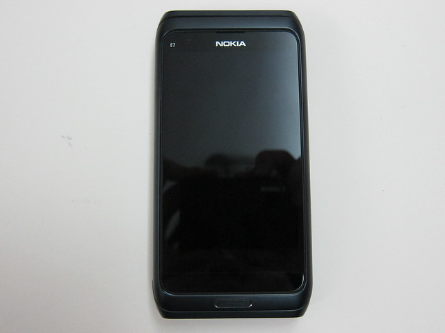
The screen of Nokia E7 is slightly bigger than Nokia N8. Nokia E7 boost a 4″ AMOLED capacitive touchscreen of 16M colors with 360px x 640px resolution, while the Nokia N8 is only 3.5″. Another difference here is the clear black display on the E7 which when compared to the N8 screen, you will notice the black on the E7 is really black. I also find that the E7 screen visibility is slightly better than the N8 under direct sunlight.
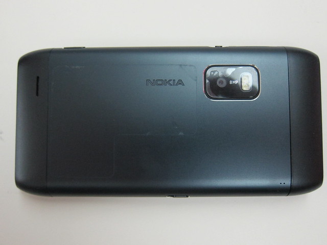
The camera of E7 is not as good as the N8. The E7 boost an 8MP camera while the N8 boost a 12MP Carl Zeiss optics camera. The N8 camera works very well under low light conditions thanks to the 1/1.83″ sensor and the Xenon flashlight while the E7 only has dual LED flash which is not too shabby either.
Do also note that the E7 does not have expandable storage unlike the N8’s MicroSD slot and hence it has only 16GB of storage, but it has a 1GB ROM instead of the N8’s 512MB.
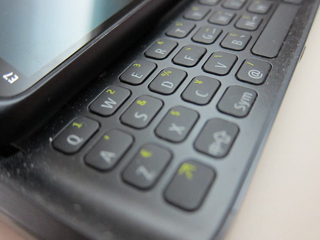
The E7 comes with a full QWERTY keyboard which is my personal favorite. The tactile feedback is good and the spaces between the keys are adequate for my fingers and most importantly I have no problem accessing the keys on the top row. Some phones just cramped their keys together and pressing the keys on the top row is an issue.
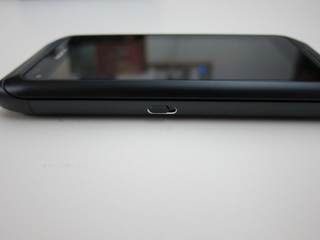
The slider on the left of the E7 is to lock your screen which takes some time to use to since the N8 one is on the right.
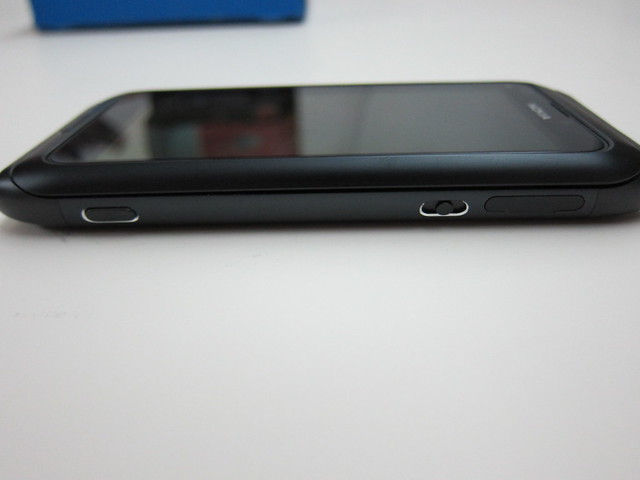
The slider on the right of the E7 is to control the volume which I think is poor design. The N8 volume up/down button wins hand down in this aspect. When I first saw the 2 sliders of the E7, I was wondering which is for volume and which is for lock having come from using the N8.
The E7 is targeted towards business users because of the keyboard while the N8 is targeted towards casual users. Personally, as a power user, I will go for the E7 because I like the keyboard and 4″ screen. The camera/expandable storage does not really matter to me because 16GB is more than enough and the camera of the E7 is not that bad either.
Check out the gallery below as it includes comparison shots with the Nokia N8.
Links
