Adobe Illustrator CS6 Review
Adobe Illustrator CS6 is included in all the Adobe CS6 suites and is available in Singapore since the end of April 2012. Prices are as follows (excluding taxes)
- Illustrator CS6 (Upgrade): S$378
- Illustrator CS6 (Full): S$906
- CS6 Master Collection: S$3,924
- CS6 Design & Web Premium: S$2,868
- CS6 Design Standard: S$1,962
- CS6 Production Premium: S$2,868
Interesting price comparison with Photoshop CS6. The upgrade version of Illustrator CS6 is more expensive than Photoshop CS6 while the full version of Illustrator CS6 is cheaper than Photoshop CS6.
Interface Color
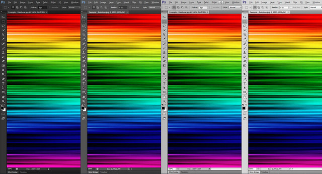
Adobe Illustrator CS6 also has user interface color change: 4 main shades of grey schemes are implemented. Different from Photoshop CS6, user has more control over UI greys by sliding through the sliders. This is individual preference. The color will not affect how your works look like across different schemes.
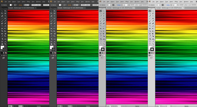
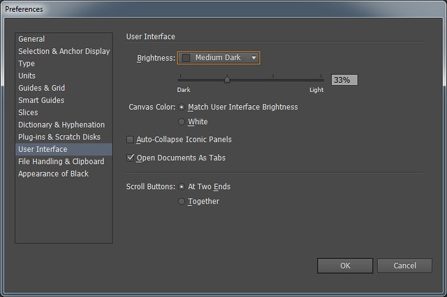
You can access the setting changes through:
Menu: Preferences > User Interface
Viewing Multiple Documents
Similar to Photoshop, you can choose to tile multiple documents easily by accessing the ‘Arrange Documents’ icon on the menu bar.
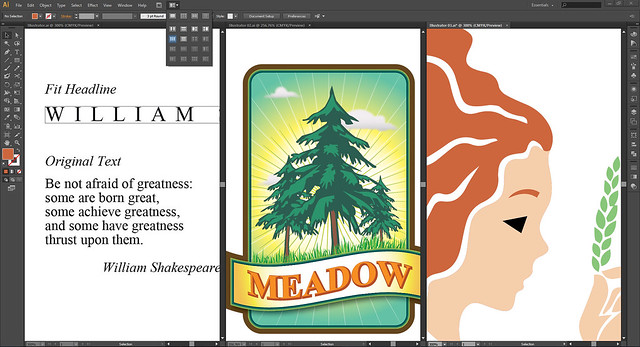
Icons are introduced to further explain how panels are arranged. But these view options are not standardised when you access them through the Menu (Window > Arrange). You either float or consolidate them.
Defining Artboards
Just as you start a fresh document, you can now define the number of artboards, the spacing, and the layout flow between these boards. Artboards have been introduced since Illustrator CS4.
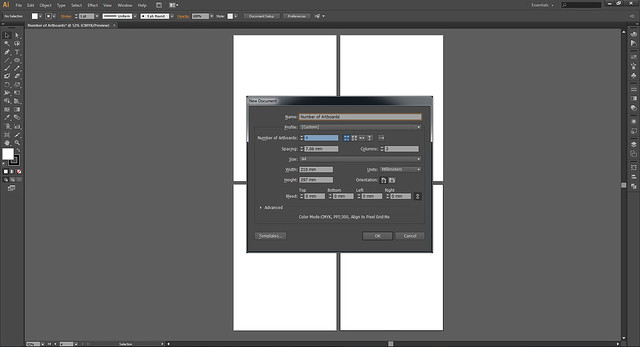
I can’t think of better use of artboards than a designer handling a corporate branding project. Sometimes, you don’t want to classify the identity, stationery designs, name card, and mailers into separately in different layers or files. Guess the best way is to work in different artboards.
You get the entire glance of the whole project. Keeping up with design consistency will be easier. What’s more, you can choose to print individual artboard without revealing the others. Definitely something you can work cohesively but also independently.
Paste On All Artboards
Paste on All Artboards is a new Pasting option. If you need certain elements to appear in all artboards, this option is cool. It replicates the element in the exact same spot throughout the different artboards. It probably comes handy when designers are trying out different layouts and some elements remain unchanged in position.
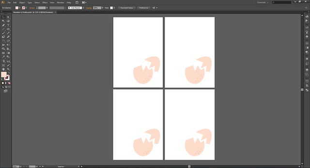
Menu: Edit > Paste on All Artboards
Keyboard Shortcuts: Alt + Shift + Ctrl + V
Applying Gradient On Strokes
Gradients can now be applied on the strokes. It also responds to different stroke thickness.
There are 3 options how gradient can appear: Apply gradient within stroke, Apply gradient along stroke, Apply gradient across stroke. Well, it is a little difficult to understand from the naming convention, but I did some trial and error.
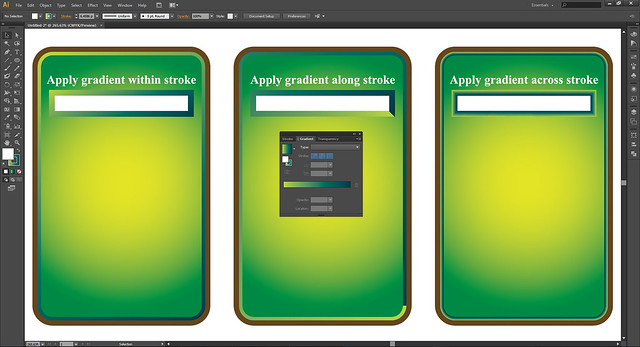
Apply Gradient Within Stroke
Universally, you will not go wrong with this stroke option. Gradient will be applied seamlessly on the stroke.
Apply Gradient Along Stroke
You’ll find a difference applying this stroke option on a rounded or a cuboids shape. Gradient on a round corner shape appears to have a distinct start and end point. On the other end, on a cuboid, the distinct start and end point transformed into a 45° bevel edge. Very stylised, ideal for icon making.
Apply Gradient Across Stroke
This stroke option doesn’t react much to a cuboid shape, but it sort of flips the gradient, create these subtle 45° edges on 4 corners. On round corners shape, this stroke option becomes an embossed border effect.

Thinking in an illustrator perspective, gradient stroke helps in the detailing of your drawing. You need not draw details of air vents out of shapes; you may now cheat with them. There are probably more realistic explorations you can also work with this.
An UI designer need not create many layers of shapes and colors to achieve the same effect you want in the past. Gradients on strokes make adjustments easier and reversible. A typographer may also benefit by creating just line art, yet able to fill them with a spectrum of colors.
Character
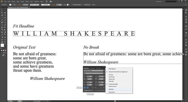
In CS6, you can access the ‘All Caps’ and ‘Small Caps’ option at the bottom of Character panel.
There is a ‘No Break’ option in the down arrow menu. If you have a long sentence, you’ll have to stretch the text field as long as the line breaks. Can’t find the use of this yet.
Fit headline isn’t new, but I thought I wanted to share. It automatically kerns your letters to fit the text box you define. A quick option for collateral layout.
Menu: Type > Fit Headline
Pattern
Pattern making is less manual. To begin with, there are already wonderful tile types to choose from: Grid, Brick by Row, Brick by Column, Hex by Column and Hex by Row. You have full control over the spacing, overlapping and number of copies to make.
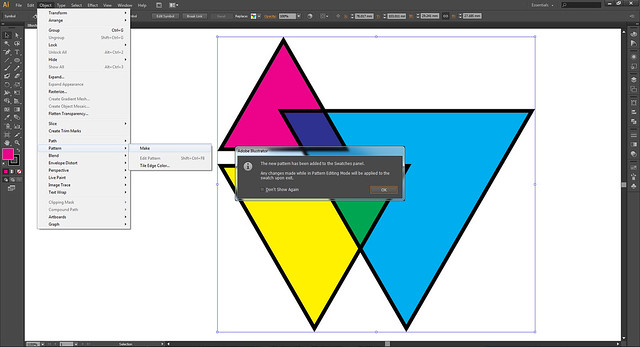
Menu: Select the objects > Object > Pattern > Make
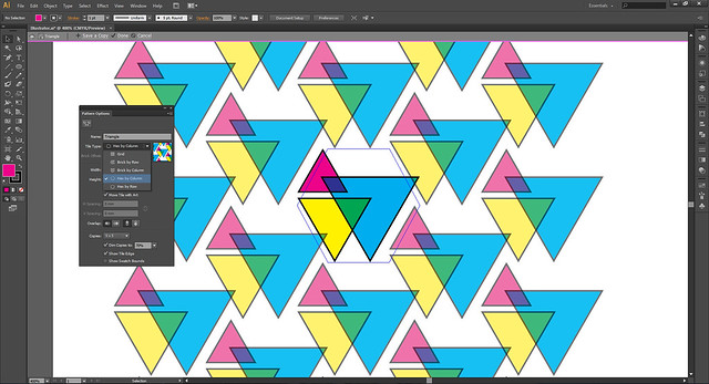
In the pattern edit mode, you can further edit your pattern. Changes will be updated in the Swatch panel.
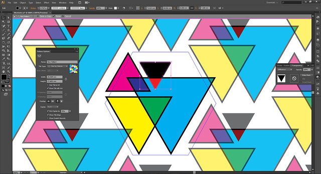
You won’t have to keep everything within the pattern tile shape. Anything outside the shape will be tile in automatically, creating more seamless pattern. Your only task is to check the look.

Crop Marks
Ever changing crop marks features, now we have the old stuff back!
In CS5, I remembered, the crop marks are digitally bounded to the artwork once created. This can still be done in CS6. You change the size of the artwork, the crop marks change the bounding accordingly.
The setbacks are: you can’t hide them in layers, or select them like separate stroke elements once they are created. The only way to access is through Appearance panel. Nothing wrong with this, but seeing the cross hairs before final just makes me nervous and lose focus.
Menu: Effects > Crop Marks
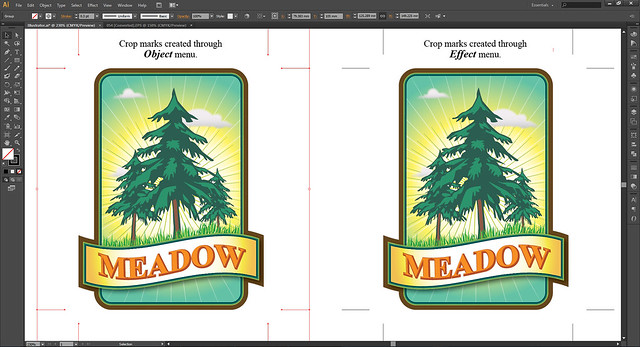
Now, they have brought back the old school way of creating crop marks. Crop marks becomes a stroke element on the layer. You can select and hide them just like before.
Menu: Object > Create Trim Marks
Conclusion
Overall, Adobe Illustrator CS6 has less drastic introduction of tools. Most of them are improvements that add on to the existing features and performances. These make things closer to what our minds are drawing.

