Singtel’s New Logo
Singtel yesterday launched a new brand identity. The agency behind Singtel’s branding exercise is Ogilvy. The last rebranding was done 16 years ago.
They also have a new tagline: Let’s make everyday better. The tagline reflects a new phase in Singtel’s transformation journey to grow beyond traditional telecommunications into multimedia and ICT services.

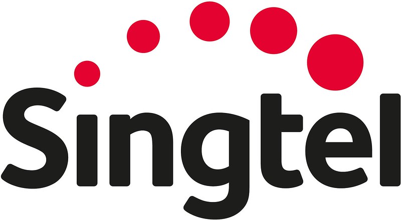
The new logo is marked by a signature red arc that reflects innovation and the ongoing evolution of the business. It symbolises Singtel’s commitment to customers to make everyday better with its service, technology and content, and to deliver experiences that are seamless and effortless in everything they do – at home, at work and when doing their favourite things.
The word “Singtel” bears friendlier curves and rounded corners to show the company is approachable, caring and optimistic. The lower case “t” celebrates the company’s heritage as a telco and marks its transformation into a leading multimedia and ICT services company.
The new Singtel aims to celebrate customers’ everyday achievements and help them discover experiences that are effortless and seamless in everything they do – at work, at home or when doing their favourite things. It marks a bold commitment to enrich lives with better service, technology and content.
Singtel will continue to strengthen its network reliability and speed, and launch new innovative products. It plans to reshape the customer experience with a series of new service promises, including shorter waiting times and distinct recognition of customer loyalty.


