Moto 360 (Second Generation) Review
Do check out my post on Moto 360 (Second Generation) – Unboxing & Setup before reading this review.

I have been using the Moto 360 (Second Generation) instead of my Apple Watch for almost two weeks now. I do miss my Apple Watch just a little. Perhaps, the only little thing that I missed about from the Apple Watch is the ability to act on notifications.
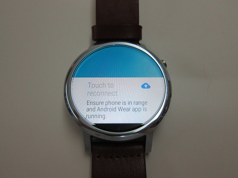
When using it with iOS, you need to keep the Android Wear on iOS running in the background. You can’t terminate the app. If the app is terminated, the watch will prompt you to reconnect. Other Bluetooth smart watches like the Pebble also requires the same thing. However, Apple Watch doesn’t have this problem (duh).
The watch doesn’t have a speaker and hence you can’t answer calls with it but it does have dual digital mics for voice searches.
Display
The 46mm model has a LCD display of about 1.56″ and it is protected by Gorilla Glass 3.
It has a resolution of 360 x 330 at 233ppi. The pixel density is slightly lower than the Apple Watch 42mm (302ppi) and hence you will be able to see the pixels on the watch. It bothers me at first but after a few days, I gotten used to it.
The bezel of the watch is about 3mm and the pixels go all the way to the edge of the screen.
The watch is not a fully rounded watch, instead there is a “flat tire” at the bottom where it houses all the watch sensors. The “flat tire” exist in the first generation Moto 360 as well.
Battery Life
For the 46mm, the battery capacity is bigger at 400mAh compared to the 42mm at 300mAh.
One setting which will greatly affect the battery life is the always-on screen.
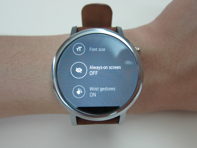
You can choose to have an always-on screen or have the screen turn off when your wrist is down.
For the always-on screen, the watch can last me about 32 hours of usage which is pretty good. I was expecting it not to last a full day after hearing bad reviews on the battery life for the first generation Moto 360.
If the always-on screen is set to off (screen turns off when your wrist is down). It is able to give me about 50 hours of usage which is slightly more than my Apple Watch.
Apple Watch defaults to having always-on screen set to off and you can’t change it. Based on my usage, the Apple Watch is able to last me about 48 hours.
It takes about 2 hours to fully charge the watch from 0% battery level.
Gestures
Because of the huge display size, it is much more comfortable swiping on the watch.
Swiping left from the watch face allows you to see a list of your Android Wear apps.
Swiping down from the top of the watch face shows you the remaining battery life and the option to mute the notifications.
If you have a notification coming in, swiping up from the bottom of the watch reveals more details about the notification and swiping right dismisses the notification.
Apps
You can’t install any apps on Android Wear if you are using it on iOS. This might not be a deal breaker because despite having the ability to install apps on my Apple Watch, I seldom use the apps on the watch at all. It is just a novelty.
There are 9 default apps on the watch. They are: Agenda, Alarm, Flashlight, Google, Moto Body, Stop Watch, Timer, Translate and Weather.
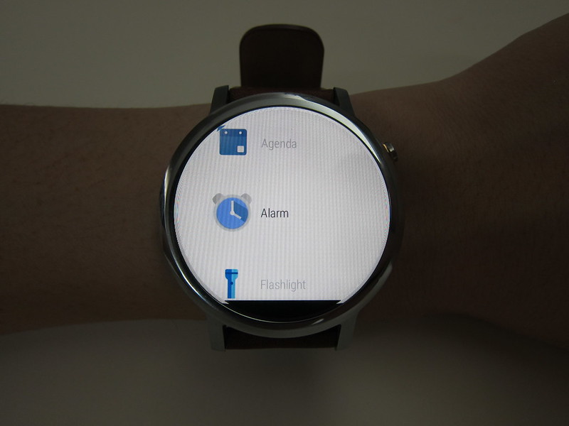
In case you are wondering, the watch doesn’t have a flashlight built-in. Instead, the Flashlight app turns your watch’s face into a white background and sets the backlight to the brightest.
Moto Body is a fitness app from Motorola which tracks your heart rate, steps taken, calories burned and distance moved. I am surprised that Google Fit is not bundled with the watch.
The remaining apps are pretty self-explanatory.
Watch Face
There are about 30 watch faces you can choose from using the Android Wear app on iOS. If you are using it on Android, you will definitely get so much more.
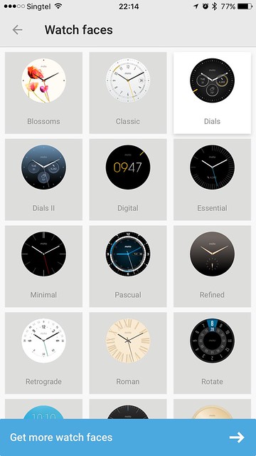
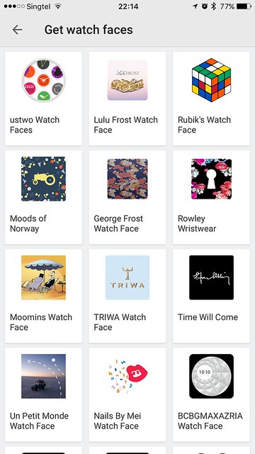
Still, I don’t really fancy any of the 30 watch faces. I still stick to the default one which is called “Dials”.
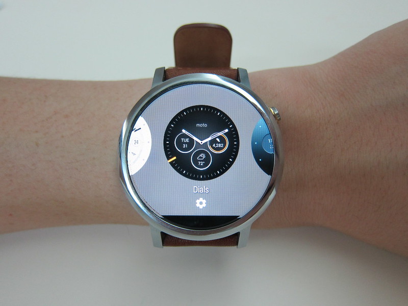
To change the watch face, you just have to press and hold on the screen, similar to Apple Watch.
Notifications
You pretty much get all the notification from your iPhone to the watch so it is not much different from the Apple Watch.
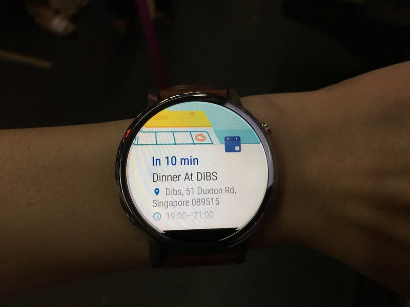
There are two areas in which the notifications stands out in Android Wear on iOS.
The first is the consolidation of notifications. If you receive multiple notifications on the same app, your watch will show you “+X more” where X is the number of notifications from the same app. Tapping on that will expand all the notifications for the app and you can read each individual notification.
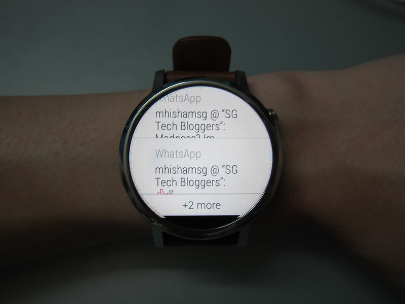
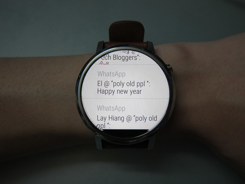
For Apple Watch case, it will just say X notifications from the app and there is no way you can read the individual notifications of the app on the Apple Watch. I am very irritated by this.
The second is the display of notification on the screen. If you receive a notification, it will be displayed on the screen whereas for Apple Watch, you will just get a red dot at the top and you will have to swipe down to see your notifications.
The only area in which Apple Watch wins is probably the ability to take action on a notification. On the Apple Watch, for example, when I get a notification from Swarm by Foursquare that I am in a certain area, I can just tap on the notification and tap check-in. I can’t do it on Android Wear. Again, not really a deal breaker but it is a good to have.
The only app that supports notification actions is the Gmail app on iOS. You can choose to archive or delete the email right from the watch. The setting name is called Rich Gmail cards and you can activate it in the Android Wear iOS app under Settings -> Email cards -> Rich Gmail cards.
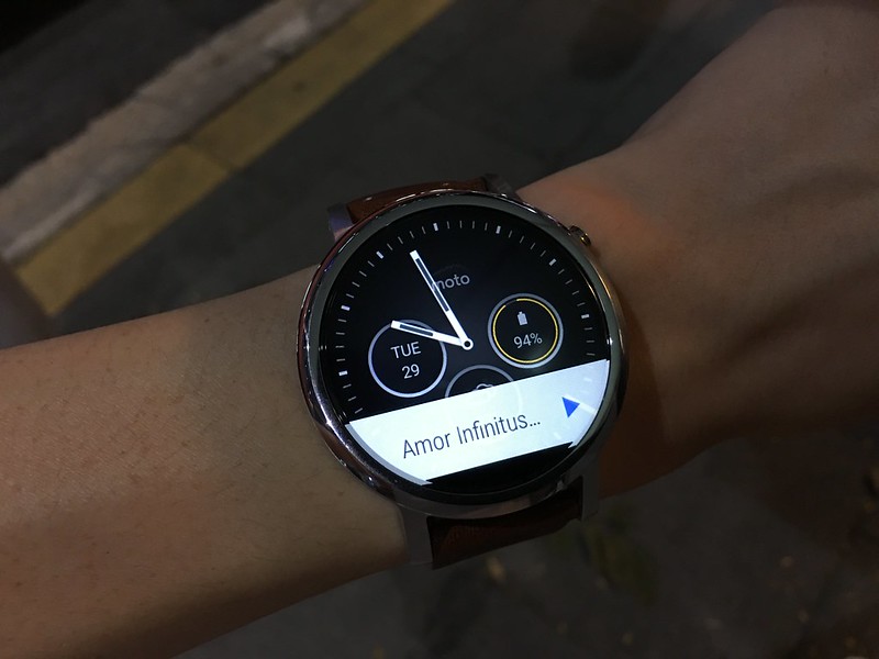
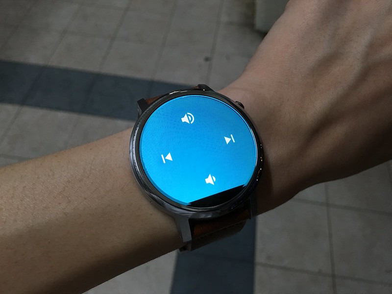
Not really related to notifications, but you are able to control your music on the default music iOS app from the watch as well.
Voice Search
You can activate voice search by lifting your wrist up and saying “Ok Google” to your watch. This is similar to the Apple Watch where you say “Hey Siri”. Personally, I don’t find this useful to me at all.
Accessories
Apple Watch supports a lot of official and third-party accessories like the watch band, chargers and docks.
For the Moto 360 (2nd Gen), official accessories are a problem. You can’t get any official bands or chargers right now in Singapore. Because Moto 360 (2nd Gen) is a relatively new product in Singapore, unlikely you will see any third-party accessories for it any time soon.
So if you need to get a spare charger, you are out of luck. If your only charger breaks down, you probably have to bring it to Lenovo Service Center in Kaki Bukit.
Summary
In iOS 7, Apple allows apps to access the full notifications on the phone. Because of this feature, notifications on Android Wear works pretty well on iOS. I am hoping that in iOS 10 or later, Apple will allow apps to act on notifications.
As smart watches are just an extension of the phone, I only rely it for notifications rather than apps and hence I didn’t really miss out on any features on the Apple Watch when using the Moto 360 (2nd Gen).
When it comes to design of the watch, circular (Moto 360) vs square (Apple Watch), I think circular looks nicer but at the same time, I find that both watches look equally good in their own ways. In terms of weight, the Moto 360 (2nd Gen) is much light than the Apple Watch 42mm, 74g vs 54g.
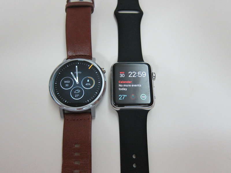
I would consider the Moto 360 (2nd Gen) a very good alternative to the Apple Watch at ¾ of the price.
Furthermore, if you get the Moto 360 (2nd Gen), you can use it on both Android and iOS devices whereas if you get the Apple Watch, you can only use it on iOS devices.
The only risk I can think of when getting the Moto 360 (2nd Gen) is the lack of official and third-party accessories, and unlikely that risk will change.
Pros:
- Large Display 46mm
- Pretty good battery life
- Notifications better than Apple Watch
- Reasonably priced
Cons:
- Non-retina screen display
- Can’t act on notifications (iOS limitation)
- Android Wear iOS app has to be running in background (iOS limitation)
- Lack of official accessories in Singapore
