Huawei Mate 10 Pro Review
In case you missed out the unboxing and design post of the Huawei Mate 10, you can check it out here.
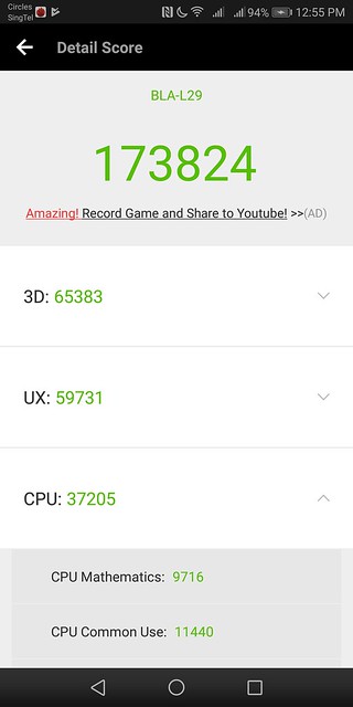
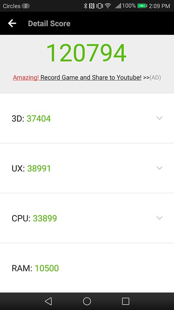
Last year, the Mate 9 scored 120,794 points on AnTuTu Benchmark. This time around, Mate 10 Pro scored 173,824 on AnTuTu, which translate to about 44% increase in performance mainly due to 3D and UX benchmarks.
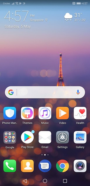
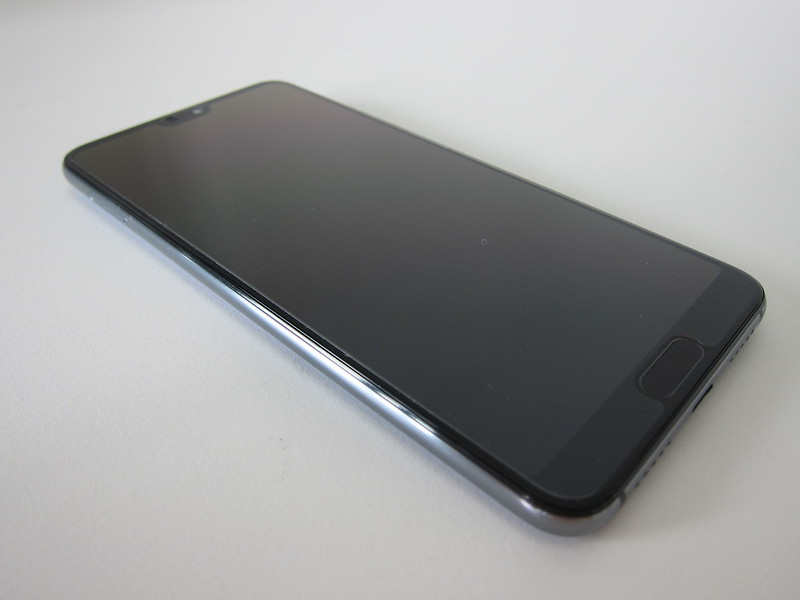
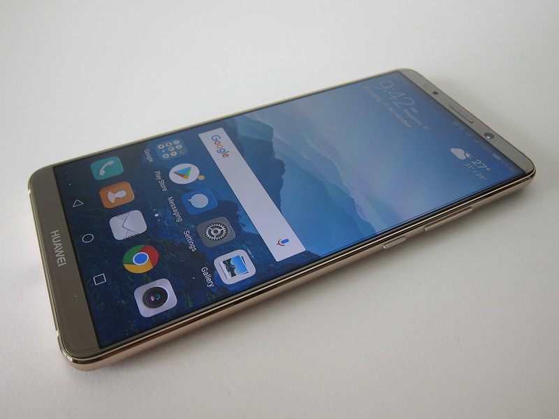
I am glad that Huawei shrunk the bezels on the top and bottom of the phone and together with moving the fingerprint sensor to the back of the phone, you get a 6″ OLED screen.
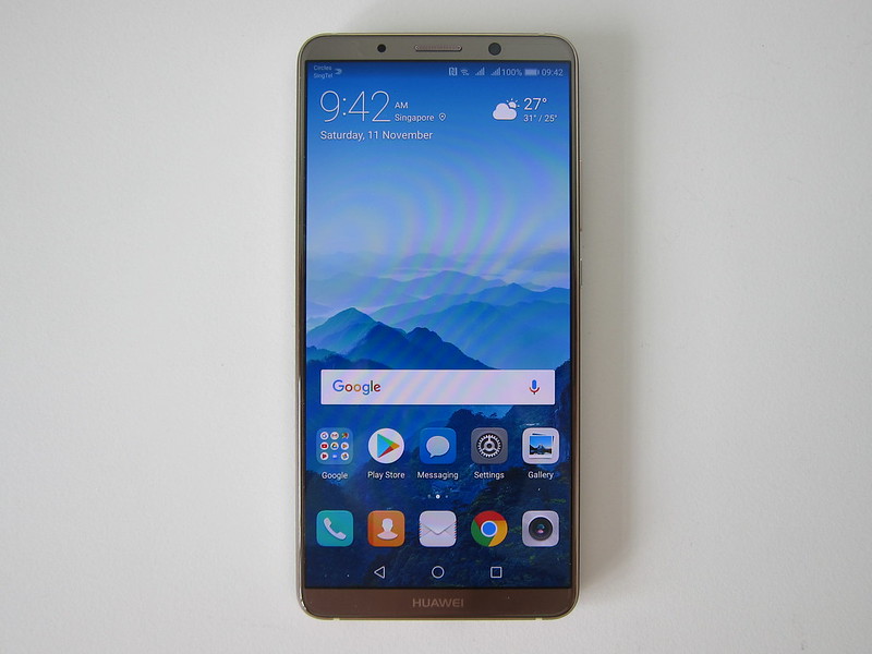
We are coming to the end of 2017, and it seems weird that Huawei still chooses to pack a full HD screen (2160 × 1080) rather than a 2K display into their flagship phone.
Huawei also chooses the new 18:9 aspect ratio which is slowly finding its way into flagship phones like the recently announced OnePlus 5T, Google Pixel 2 XL, Samsung Galaxy Note 8 and LG V30. Because some apps are not optimized for full-screen display, they might not render correctly in the 18:9 ratio. Hence, the app will be displayed with black borders around the app window. If you like, you can tell the OS to ignore it and force the app to go into full-screen mode. So far, most of the apps work for me despite not optimized for full-screen display.


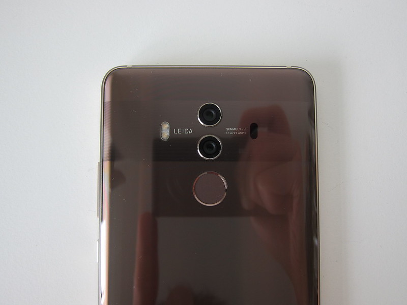
I welcome the idea of moving the fingerprint sensor to the back to allow for thinner bezels in front. My first encounter with a fingerprint sensor on an Android phone is the Nexus 6P, and it was at the back. I prefer Android phones to have the fingerprint sensor at the back to differentiate itself from iPhones.
Similar to Mate 9, Mate 10 Pro comes with a 4,000mAh battery which should be able to last you about two days of normal usage. Perhaps I am a heavy user, and hence I only managed to get slightly more than a day of usage.
EMUI was 5.0 when it was launched together with the Mate 9, but when the Mate 10 Pro was launched, it was bundled with EMUI 8.0. Huawei skipped three versions so that the EMUI version number will be in sync with the Android version number.
Mate 10 Pro comes with Android 8.0, Oreo.

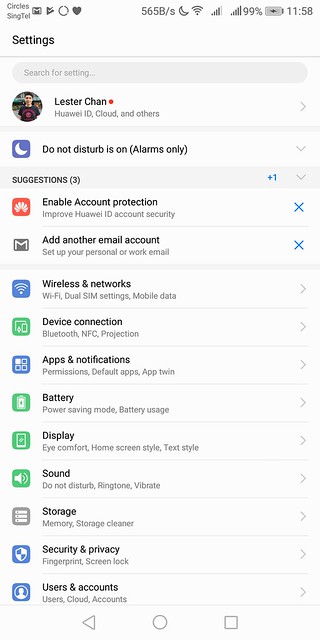
I will not be going through EMUI since I covered it in my Mate 9 review and it is pretty much the same.
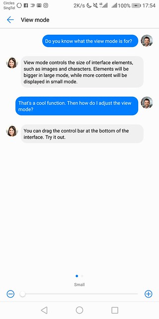
One thing I want to highlight again is the view mode. By default, the view mode is large, and hence everything looks big, and it takes up a lot of screen space. Since I have the same experience coming from Mate 9, the first thing when I got my phone is to switch the view mode to small. While I am there, I also changed the text size to small so that I can view more things on the 6″ screen.

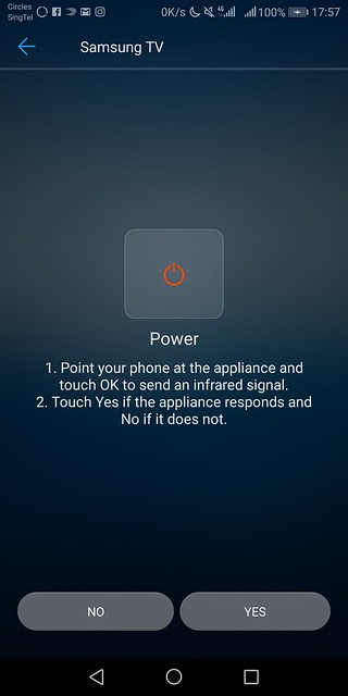
Mate 10 Pro also comes with IR blaster, so you can use the included app called, Smart Controller, to control any of your infrared devices like television or air conditioners.

Photography
Mate 10 Pro has two rear cameras with LEICA Summilux-H f/1.6 lens. One 20MP monochrome camera and a 12MP color camera with Optical Image Stabilisation (OIS).
Huawei boasts it’s Kirin 970 processor with AI that powers the Mate 10 Pro. The two words “with AI” are just marketing words. What it means is that Huawei embeds a Neural Processing Unit (NPU) on it’s Kirin 970 processor. NPU speeds up AI related tasks such as machine-learning like how GPU speeds up graphics-intensive tasks such as 3D rendering.
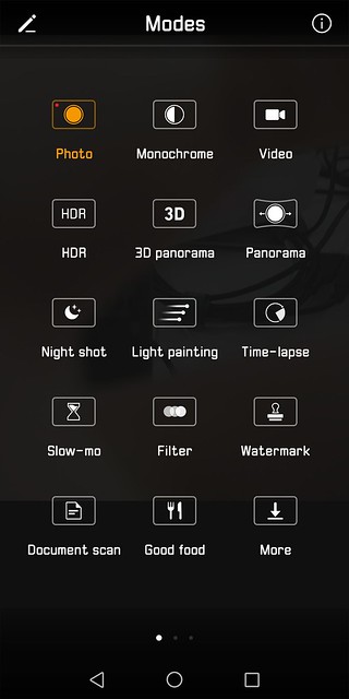
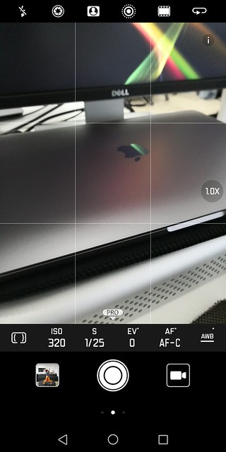
One of the uses of this AI is to allow the rear camera to automatically recognize the items or scenes you are shooting and adjust the camera settings accordingly.
Since I am not a photographer, I love this feature. I want things to “just work” and looks good at the same time.
I have covered wide aperture and hybrid zoom back in my review of the Mate 9, so I will not be covering it here.
Just a recap, when the wide aperture is enabled, both RGB and monochrome camera are used when a photo gets taken. This allows you to refocus on any subjects in the photos after the photo is taken.
Hybrid Zoom uses the photo taken from the monochrome camera for lossless digital zooming and uses the color obtained from the RGB camera to give you the effect of the 2x zoomed photo.
I am comparing the photos taken on my Mate 10 Pro with my iPhone X.
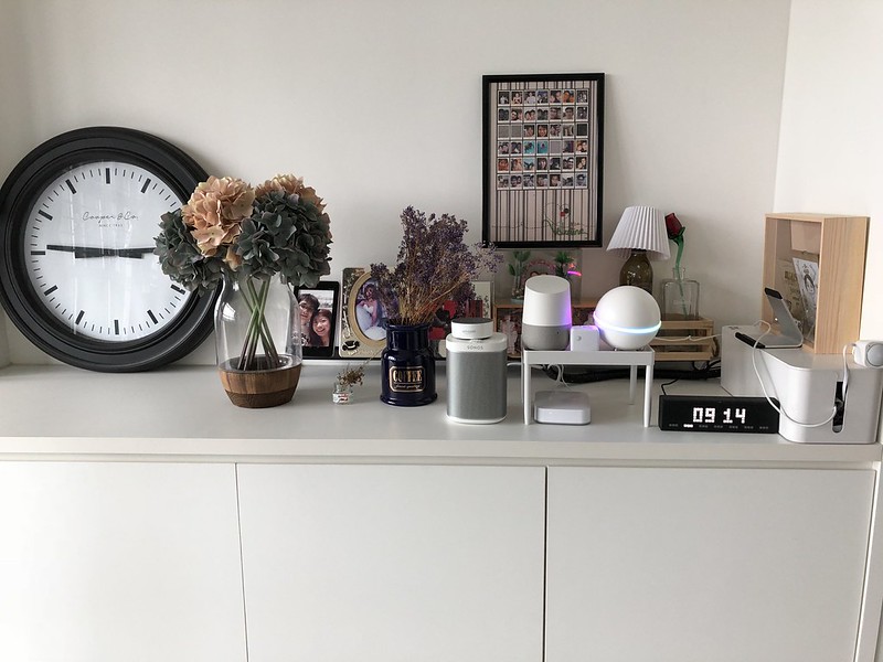
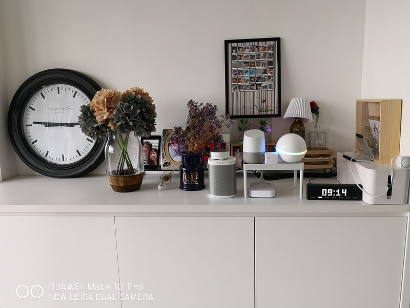


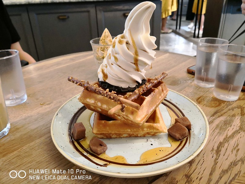

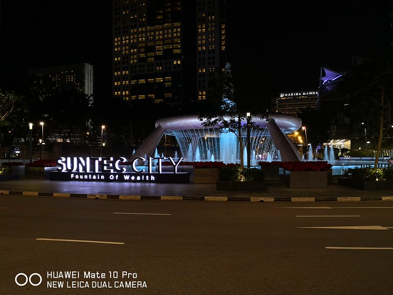


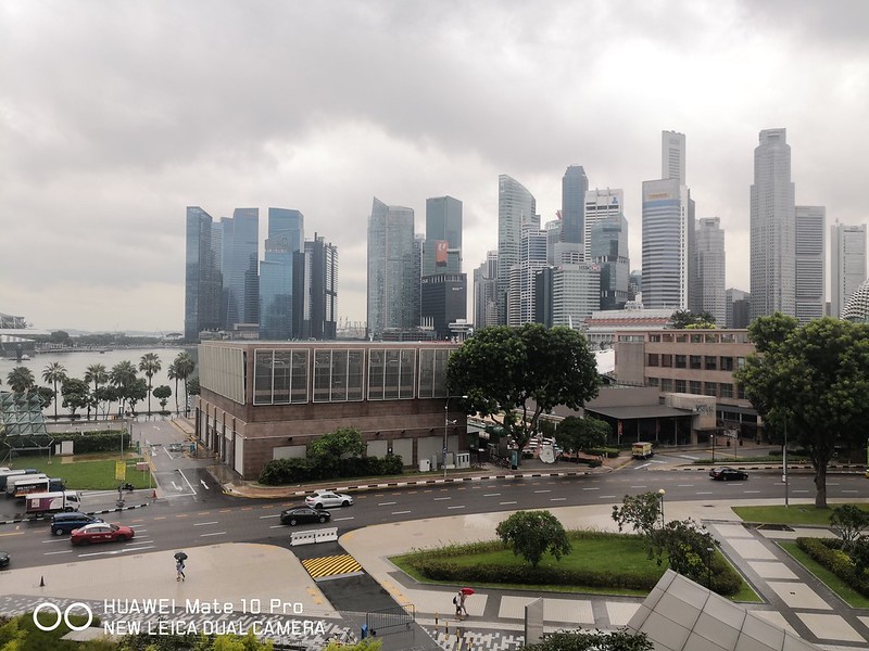



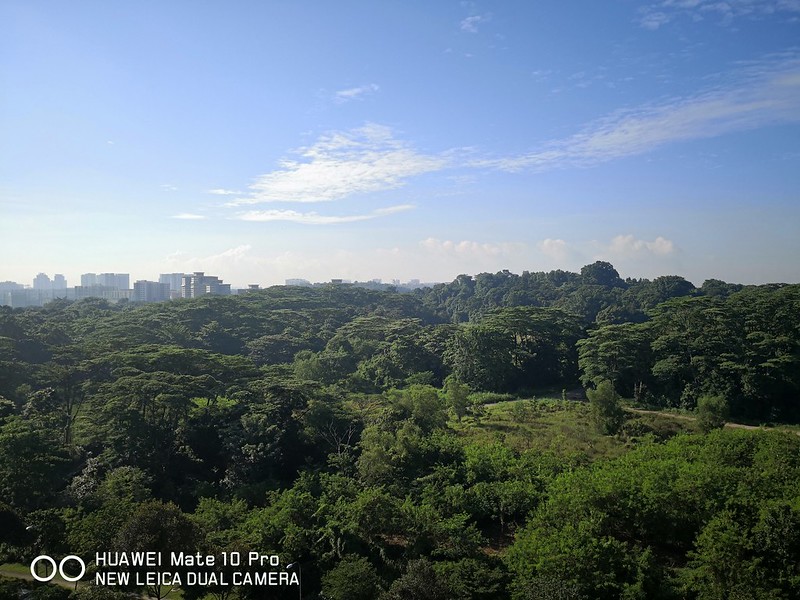
Photos taken by the iPhone X looks closer to what your eyes see.
Photos taken by the Mate 10 Pro looks more processed and hence it looks brighter and more instagrammable.
Both has its pros and cons and can be subjective. But among my friends and colleagues, the general consensus is that photos taken by Mate 10 Pro look nicer.
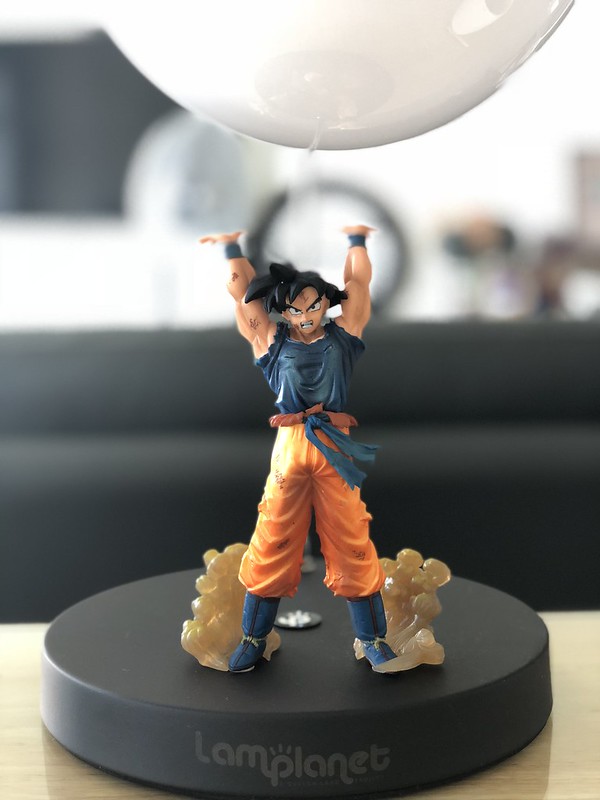
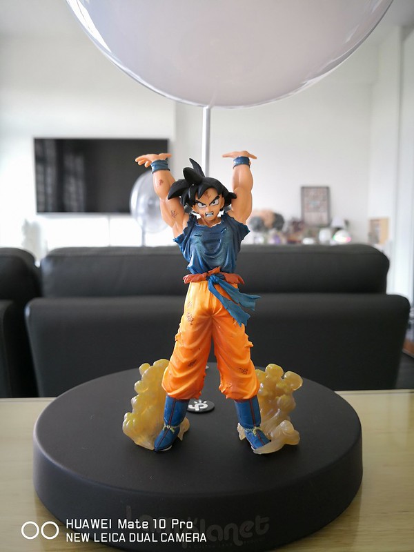
Most of the reviews these days are talking about portrait mode, we have seen it on the iPhone 7/8 Plus, iPhone X, Google Pixel 2 and now on the Mate 10 pro. So here are some potrait mode shots for comparison.


Translator App
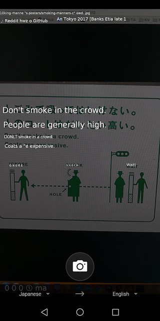
Besides photography, another use of the AI chip is to recognize text within an image and provide a translation if needed.
Microsoft has it’s own translator app called, Microsoft Translator, and Huawei has worked with Microsoft so that the app will make use of the Mate 10 Pro’s NPU for better performance.
For Microsoft Translator, you just have to take a picture, and the app will do the rest.
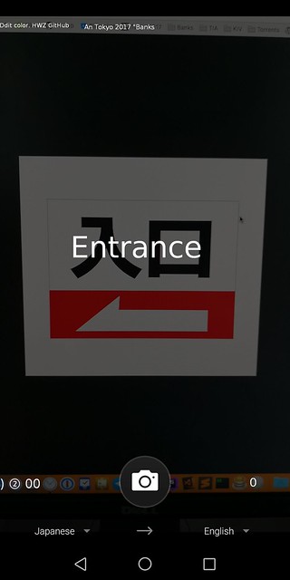

For Google Translate, you will need to align the text to be translated within the given area of the app.
I have tested it side-by-side with Google Translate, and despite both being equally fast, Microsoft Translator is slightly more accurate and have better UX as compared to Google Translate.

Desktop Mode
One of the most underrated features of the Mate 10 Pro is the Desktop Mode. You do not need additional accessories to make that happen, unlike Samsung DeX.
Just plug in any USB-C to HDMI or USB-C to DisplayPort cables from your monitor and it will transform your Mate 10 Pro into a desktop computer with a full desktop UI.

You can continue using your phone separately while still in the desktop mode. The only restriction is that you can’t open the same app on the phone and in the desktop mode.
Of course, not all apps are optimized for the desktop mode. Huawei default apps work fine. I tested with Chrome, Plex and Trello and all work fine. Twitter and Slack work, but it is not optimized.
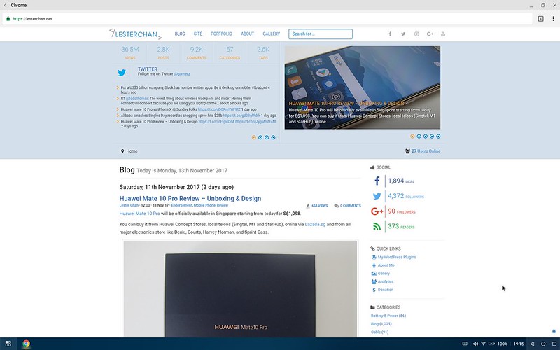
For external keyboard and mouse, you can pair it with Bluetooth or use an adapter if you want. I have tested the Mate 10 Pro Desktop Mode with Apple USB-C Digital AV Multiport Adapter and it works!
I am able to get a full desktop experience with a monitor, a keyboard, and a mouse.
My monitor’s HDMI cable is plugged into the adapter along with my Logitech Unifying Receiver, so both my Logitech keyboard and mouse will work at the same time without needing an additional USB port.
Conclusion
The Mate 10 Pro is reasonably priced at S$1,098. It is a good alternative to the more expensive Galaxy Note 8 or Google Pixel 2 XL.
There are some trade-offs such as the full-HD screen, lack of expandable memory slot and lack of 3.5mm headphone jack. But the price of the phone and camera quality is good enough to make up for it.
As I had gone with Bluetooth earphones long before Apple decided to ditch the 3.5mm headphone jack, I don’t miss it.
The Mate 10 Pro comes with 128GB of storage which is more than enough for most users. If you are finding that your photos are taking up too much space, offload it to Google Photos.
Right now, the most apparent use of AI is with the camera. I hope going forward, the phone will be able to learn my usage and prompt me things like traffic, apps that I will use now, upcoming schedules and recommendations.

